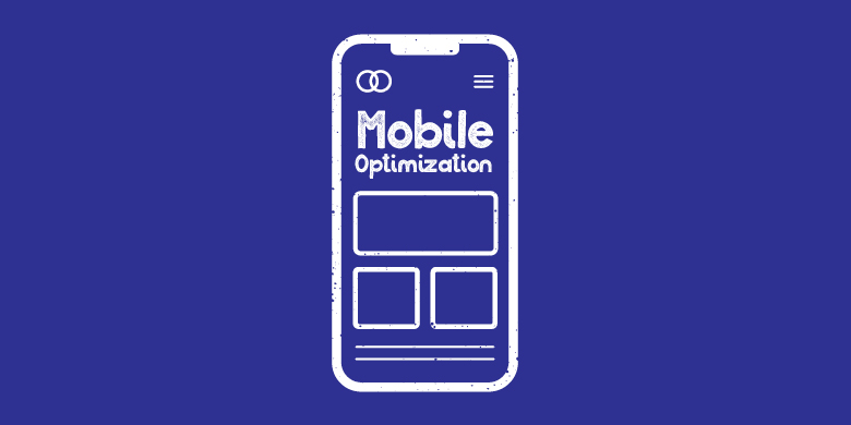
When is the last time you wanted to check something, and with your phone in your back pocket, you thought, “Oh, I’ll wait until I can sit down at my computer.” No way. You’re pulling out that smartphone and looking up that product while it’s on your mind and you’re standing in line at Chipotle anyway. This is why mobile optimization should be at the top of your priority list. Here are some important steps to take:
Look at videos and other visuals. If you’re up-to-speed on the latest marketing techniques, you’re likely displaying some great visual elements on your site, like videos and GIFs. When you visit your site from a mobile device, are these videos too big for the screen? Be sure that when someone accesses your site from a smartphone, they get the same great experience that they would on a laptop.
Check the text. Do mobile visitors need to scroll or zoom to read your text? If so, you’re not mastering mobile optimization. A responsive site will automatically detect the type of device and make adjustments so that all text is visible.

Interactivity and clickability: Is your mobile user able to access the same menu options, buttons and other interactive features that a desktop user can? While a button on your site can get away with being small for a mouse click, fingers are a whole different story. Make sure buttons are large and not too close to other buttons so that people don’t end up getting with what could be a great website experience.
Loading time: Your website should load quickly, whether it’s being viewed on a desktop or a tablet. This not only affects customer interaction; it also has a lot to do with your search engine rankings for Google and other engines. Keep in mind that if your site takes more than a second or two to load, your visit is likely over.
Compatibility: The type of coding you use has a lot to do with whether your site will work well on a mobile device. Any type of Flash-based audio or video won’t work on most mobile devices. If you’re using modern coding, this shouldn’t be a problem.
Pop-up addiction: It worked for VH1; it’s not working for you. If you have a lot of pop-ups happening on your site, minimize them for mobile. A pop-up on mobile has all the charm of that annoying friend that’s always up in your face.
Intuitive design: This one’s harder to measure, but it’s all about how easy your site is to navigate on a mobile device. Spend some time tooling around to see how easy it is to access various features, and invite a few people not involved with your company to take a tour.
Still need assistance? Mobile optimization may require a few tweaks, and our SJC Marketing web design team is here to help. Contact us for an appointment, and we’ll make sure you’ll never miss a mobile visit again.